Successful trading analysis is a skill of synthesis, bringing together different types of data to build a complete market picture. Two foundational categories of this data are on-chart and off-chart analysis tools. Understanding what each offers, their inherent strengths and weaknesses, and how to strategically combine them is the key to making more informed and timely trading decisions. This guide breaks down both approaches, highlighting specific tools grounded in 2026 research, and provides a practical framework for integrating them into a holistic routine.
Defining On-Chart Analysis: Price-Action Indicators and Overlays
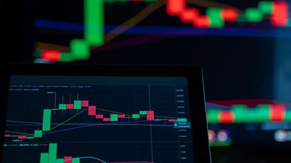
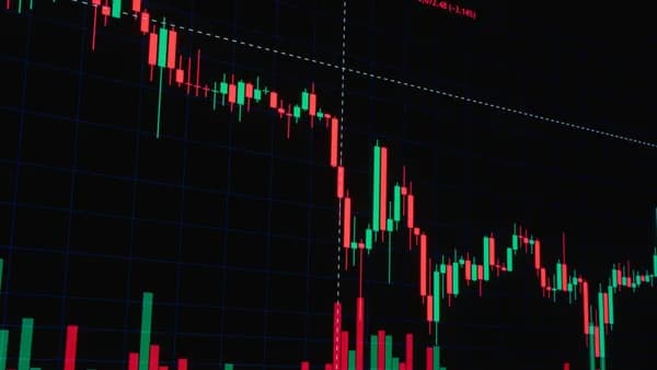
On-chart analysis tools are the instruments plotted directly on the price chart itself. They are mathematical calculations derived from the primary market data of price, volume, and sometimes time. Their primary function is to analyze the price action happening within the chart's frame, helping to define trends, measure momentum, and identify potential support and resistance zones.
The core components of on-chart analysis include:
- Price Indicators: These are separate plots, often below or above the main price window, like the Relative Strength Index (RSI) or Moving Average Convergence Divergence (MACD).
- Overlays: These are drawn directly onto the price candles, such as moving averages, Bollinger Bands®, or trendlines.
- Pattern Recognition: The identification of classical chart patterns like head and shoulders, triangles, or double tops.
On-chart tools provide a focused, internal diagnosis of a security's price behavior, but they are inherently reactive, calculated from past and present price data.
The power of on-chart analysis lies in its ability to standardize price movement, turning raw, often chaotic candlesticks into structured, interpretable information. However, as we will explore later, this internal focus is also its primary limitation.
Defining Off-Chart Analysis: Breadth, Sentiment, and Intermarket Data
Off-chart analysis tools examine data that is not directly plotted on the price chart of the instrument you are trading. This external context is crucial for understanding the why behind the price movement and for gauging the market's overall health. These tools help answer questions like: Is the buying or selling broad-based? What is the prevailing market sentiment? Are other related asset classes confirming the move?
Key categories of off-chart analysis include:
- Market Breadth: Metrics like the Advance/Decline Line, which tracks the number of stocks rising versus falling in an index, indicate whether a market move is supported by broad participation or driven by a few large players.
- Market Sentiment: Gauges like the CBOE Volatility Index (VIX) or put/call ratios measure the prevailing fear, greed, or complacency among market participants.
- Intermarket Analysis: Studying the relationships between different asset classes, such as the correlation between the US Dollar (DXY) and gold, or between bond yields and equity indices.
- Fundamental & News Context: Earnings reports, economic data releases, and geopolitical events that can fundamentally alter a security's trajectory.
Off-chart tools provide the essential external context, offering early warning signals and helping to separate sustainable trends from short-lived, isolated price moves.
Popular On-Chart Tools: Moving Averages, MACD, Bollinger Bands
Based on widespread usage in trading communities and platforms, several on-chart tools are considered essential for technical analysis. Their functionality is often integrated into modern AI chart analysis tools that synthesize these indicators automatically.
| Tool | Primary Function | Common Use Case |
|---|---|---|
| Moving Averages (e.g., SMA, EMA) | Smooths price data to identify trend direction and dynamic support/resistance. | A rising price above a key moving average (like the 50 or 200-period) suggests an uptrend. Crossovers of shorter and longer MAs can signal trend changes. |
| MACD (Moving Average Convergence Divergence) | Measures momentum by comparing two moving averages. The histogram shows acceleration/deceleration. | Signal line crossovers and divergences between MACD and price can indicate weakening momentum before a trend reversal. |
| Bollinger Bands® | Defines a dynamic envelope around price based on standard deviation, indicating volatility and potential overbought/oversold conditions. | Periods of low volatility (band contraction) often precede high-volatility breakouts. Price touching the outer bands can signal an extreme, but not necessarily an immediate reversal. |
| Relative Strength Index (RSI) | A momentum oscillator that measures the speed and change of price movements on a scale of 0 to 100. | Readings above 70 are traditionally considered overbought, below 30 oversold. Divergences between RSI and price are key reversal signals. |
Modern AI tools like ChartSnipe and ChartGuru are built to reason about these exact indicators. For instance, ChartSnipe's Custom Mode Creator allows users to toggle which indicators, RSI, MACD, EMA, Bollinger Bands, the AI should specifically analyze when generating a trade plan. Similarly, ChartGuru synthesizes trend, momentum, and key levels from these indicators into a single confidence-scored trade setup.
Essential Off-Chart Tools: Advance/Decline Line, Put/Call Ratios, VIX
To move beyond the chart, traders incorporate specific off-chart metrics. The research highlights platforms that provide or integrate this broader market context.
| Tool | What it Measures | Why It's Useful |
|---|---|---|
| Advance/Decline Line | The cumulative difference between advancing and declining stocks within an index. | Confirms the health of a market trend. A rising market on a falling A/D line suggests weak, narrow participation and warns of a potential reversal. |
| Put/Call Ratios | The volume of put options traded relative to call options. Extreme readings can signal contrarian sentiment. | High put/call ratios often indicate pervasive fear (potentially a bullish contrarian signal), while very low ratios can indicate complacency or euphoria. |
| VIX (CBOE Volatility Index) | The market's expectation of 30-day volatility, derived from S&P 500 index option prices. Often called the "fear gauge." | A rising VIX in a falling market confirms fear-driven selling. A low or falling VIX in a rising market suggests stable, confident buying. Spikes often coincide with market bottoms. |
| News & Economic Calendar | Scheduled events (Fed decisions, CPI reports) and unscheduled news with market impact. | Provides fundamental context. A technically perfect setup can be invalidated by a single news event. Some AI tools, like ChartSnipe's NewsImpact layer, are built to flag these invalidations. |
Platforms that offer multi-market scanning, like Finviz with its heatmaps and sector views, are excellent for visualizing breadth and sector rotation off-chart. ChartGuru includes news context in its analysis to provide a "read you can act on," blending technical setup with external factors.
The Lagging Nature of On-Chart Indicators and How to Compensate
A critical limitation of on-chart tools is that they are lagging indicators. They are calculated from past price data, meaning they confirm what has already happened rather than predict what will happen. An RSI divergence, for example, signals that momentum has already shifted, often after a significant portion of the price move is complete.
Relying solely on on-chart indicators can lead to late entries and exits, as they are inherently backward-looking. The most precise level analysis can still be dangerous if it's based on stale data from a screenshot.
Research on AI chart tools starkly illustrates this risk. General AI tools that analyze static screenshots but lack live data feeds "hallucinate specific price levels" and cannot verify if a level has already been broken by the time the analysis is delivered. This makes them "actively dangerous," according to testing.
How to Compensate:
- Prioritize Live Data: Use tools integrated with live feeds. For example, ChartSnipe pulls live prices every 5 minutes and cross-references them against the screenshot before giving an analysis, ensuring support/resistance levels are current.
- Use Price Action as the Primary Guide: Treat the raw candlestick patterns, swing highs/lows, and volume as the leading source of information. Let indicators serve as confirming or filtering tools, not the primary signal generator.
- Seek Confirmation from Multiple Timeframes: A signal on a higher timeframe (like the daily chart) carries more weight than one on a lower timeframe (like the 5-minute). Use higher-timeframe charts to establish the dominant trend, which on-chart indicators can then help you navigate on lower timeframes.
Using Off-Chart Tools for Early Warning Signals and Market Context
This is where off-chart analysis shines. While on-chart tools tell you what is happening on one asset, off-chart tools can tell you why it might be happening and how reliable the move is. They can serve as early warning systems.
For instance, if the S&P 500 is making a new high but the Advance/Decline Line is trending downwards, it's a powerful divergence suggesting internal market weakness that the price chart alone may not yet show. This could warn you against taking new long positions based on bullish on-chart signals alone.
Similarly, a sudden spike in the VIX while your stock chart shows a minor pullback can indicate you are facing a broad, sentiment-driven sell-off rather than a stock-specific technical correction. This context should influence your risk management, perhaps prompting a wider stop-loss or a decision to stay out of the market entirely.
Off-chart analysis is key to distinguishing between a high-probability, broadly-supported setup and a low-probability, isolated price blip.
AI tools that incorporate this context add a layer of robustness. ChartGuru's analysis includes "risk context" and aims to anchor a trade idea to a real invalidation level based on a synthesis of data, which logically includes off-chart risk factors.
Case Study: Spotting a Divergence with On-Chart RSI and Off-Chart Breadth
Imagine a scenario where a trader is analyzing an ETF tracking the NASDAQ 100 (QQQ) in early 2026.
- On-Chart Signal: The QQQ daily chart shows price making a successive higher high. However, the RSI is making a lower high, a classic bearish divergence. The on-chart MACD histogram is also declining, indicating slowing upward momentum. The trader's ChartSnipe "Full Snipe" analysis flags this momentum divergence and provides a structured trade plan suggesting caution or a potential short setup.
- Off-Chart Check: The trader then checks market breadth. Using a platform like Finviz or a dedicated breadth dashboard, they see that the NYSE Advance/Decline Line has been in a clear downtrend for the past two weeks, even as the QQQ and SPY made new highs. Furthermore, the Put/Call Ratio has dropped to an extremely low level, indicating excessive bullish complacency.
- Synthesis: The on-chart tool (RSI) provided an initial warning of weakening momentum within the QQQ chart. The off-chart tools (A/D Line, Put/Call Ratio) provided the crucial context that this weakness was not isolated but part of a broader market deterioration masked by index-level price action. This confluence of on-chart and off-chart divergence would be a strong, high-conviction signal to avoid long entries or even consider a short position, with a stop-loss above the recent price high.
This combined signal is far stronger than either piece of evidence alone.
Platform Integration: Where to Find Off-Chart Data on Top Trading Platforms
While dedicated platforms like TradingView excel at on-chart analysis, finding integrated off-chart data requires knowing where to look or using complementary tools.
| Platform | On-Chart Strength | Off-Chart Data Access |
|---|---|---|
| TradingView | Best-in-class charting, vast community scripts (Pine Script), numerous built-in indicators. | Limited native off-chart data. Users often rely on custom scripts or external websites. Its strength is the charting canvas, not breadth/sentiment dashboards. |
| TrendSpider | Powerful automated technical analysis, auto-trendlines, multi-timeframe alerts. | Focuses on automating on-chart technicals. Off-chart context is not its primary function, though it can scan for certain market-wide conditions. |
| Finviz | Basic charting. | Excellent for off-chart screening. Free heatmaps, sector maps, and group trends provide instant visual breadth analysis for US markets. |
| Overcharts | Advanced charting, volume profile, simultaneous broker connections. | As a technical analysis software platform, its focus is on chart-based tools (on-chart). It facilitates deep analysis of the data on your screen but isn't a source for external breadth data. |
| ChartGuru | AI synthesis of on-chart indicators into a confidence-scored trade setup. | Integrates news context into its analysis. While not a full breadth dashboard, it brings essential external "invalidation" context into the trade read. |
| Specialized Terminals (e.g., Bloomberg) | Comprehensive. | The gold standard for integrated off-chart data (breadth, sentiment, fundamentals, news). Access is cost-prohibitive for most individual traders. |
For most retail traders, the practical solution is a multi-platform approach: using TradingView or Overcharts for deep on-chart work, while keeping a browser tab open for Finviz heatmaps and an economic calendar. AI tools like ChartGuru or ChartSnipe that weave in news and live data act as a bridge, bringing some of that external context into the analysis workflow.
Building a Dashboard: Combining Charts with Separate Analysis Panels
The most effective traders don't use just one screen or one platform. They build a dashboard that visually combines on-chart and off-chart data streams. Here’s how to construct one based on available 2026 tools:
- Primary Charting Window: This is your main workspace. Use TradingView, Overcharts, or even the charting module within your broker's platform. Here, you apply your key on-chart indicators (Moving Averages, RSI, MACD).
- AI Analysis Panel: Have a tool like ChartGuru or ChartSnipe open in a separate window or monitor. Use it to get a synthesized, second opinion on your active chart. You can search the symbol directly in ChartGuru for a live read, or upload a screenshot to ChartSnipe for an analysis that checks live prices. This panel delivers a condensed, actionable summary of the on-chart data.
- Breadth & Sentiment Monitor: Keep a browser tab pinned to Finviz's market overview or a specific VIX/A-D line chart. This is your constant off-chart health check.
- News Ticker: Use an affordable real-time news service like Benzinga Pro (noted in other research) or rely on the news context provided within your chosen AI tool (e.g., ChartSnipe's NewsImpact).
A dashboard isn't about having more information, but about having the right information organized for rapid synthesis. The goal is to see on-chart signals and off-chart context simultaneously, reducing cognitive load and time to decision.
Developing a Holistic Routine: A Step-by-Step Workflow for Your Analysis
To put it all together, follow this step-by-step workflow that integrates both on-chart and off-chart analysis:
- Broad Market Check (Off-Chart First): Before looking at any individual chart, assess the overall market. Check the VIX, major index futures (ES, NQ), and a breadth map like Finviz. What is the dominant sentiment? Is the tide rising or falling? This determines your overall risk appetite.
- Identify Opportunities (Screening): Use a screener, either within TradingView, TrendSpider, or Finviz, to find assets aligning with your broad market view (e.g., "strongest stocks in a weak market" for shorts).
- Deep On-Chart Analysis: Take your candidate to your primary charting platform. Apply your technical framework. Identify clear support/resistance, trend, and momentum using your preferred indicators.
- Get an AI Synthesis: Upload the chart to a tool like ChartSnipe (using a mode like "Full Snipe" or "Liquidity Snipe") or run the symbol through ChartGuru. This provides a structured, confidence-scored second opinion that includes key levels and a suggested trade plan. Crucially, it will use live data to validate the levels on your screenshot.
- Seek Off-Chart Confirmation: Look for alignment. Is the sector this stock belongs to strong or weak (Finviz sector map)? Is there upcoming earnings or economic news (Calendar) that could invalidate the setup? Does the broader market context (Step 1) support the trade's direction?
- Make a Decision & Manage Risk: Only if on-chart setup, AI analysis, and off-chart context align do you consider a trade. Base your position size and stop-loss not just on the chart's volatility (ATR), but on the volatility of the broader market (VIX level). Enter the trade and manage it according to your plan.
Following this routine ensures you never evaluate a trade in a vacuum. You consistently blend the internal, detailed view from on-chart tools with the external, contextual view from off-chart tools.
FAQ
What's the main drawback of relying only on on-chart analysis? The primary drawback is that on-chart indicators are lagging. They confirm past price action, which can lead to late entries and exits. Research on AI tools shows that analyzing static charts without live data can result in dangerously inaccurate support/resistance levels, as the market may have already moved past them.
Can AI trading tools perform off-chart analysis? At the time of writing, most AI tools focus on synthesizing on-chart data. However, leading tools are beginning to integrate off-chart context. For example, ChartSnipe includes a daily NewsImpact report to flag fundamental invalidations, and ChartGuru incorporates news and provides broader "risk context" in its trade setups, moving beyond pure price analysis.
I use TradingView; where can I find good off-chart data there? TradingView's core strength is on-chart analysis. While it has some basic market overview widgets, for robust off-chart data like detailed breadth indicators or advanced sentiment metrics, traders typically need to use external websites like Finviz or dedicated data terminals, which they then consider alongside their TradingView charts.
Are free tools sufficient for combining on-chart and off-chart analysis? Yes, a viable free combination exists. You can use TradingView's robust free tier for on-chart work, Finviz's free heatmaps and screeners for off-chart breadth, and a free tool like ChartGuru or a trial of ChartSnipe to provide AI-powered synthesis that connects the two. This creates a powerful, cost-effective dashboard.
How do I know if an on-chart signal is trustworthy? An on-chart signal gains trustworthiness through confluence (multiple indicators agreeing) and, most importantly, confirmation from off-chart context. A bullish RSI divergence is far more compelling if it occurs when market breadth is improving and sentiment is shifting from fear to neutrality, rather than occurring amidst broad market selling.
Bottom Line
Effective trading analysis is neither purely on-chart nor off-chart; it is the strategic integration of both. On-chart tools like RSI and moving averages provide a detailed, if lagging, diagnosis of price behavior within your chosen asset. Off-chart tools like breadth indicators and the VIX supply the essential external context, offering early warnings and validating the sustainability of a trend. The research on modern AI tools like ChartSnipe and ChartGuru demonstrates a move towards synthesizing these data streams, checking live prices, incorporating news, and providing confidence-scored reads that consider more than just the chart pixels. The winning approach is systematic: start with the broad off-chart context, drill down into precise on-chart setups, and use intelligent tools to synthesize the two into clear, actionable, and well-contextualized trading decisions.