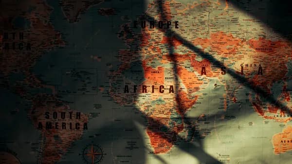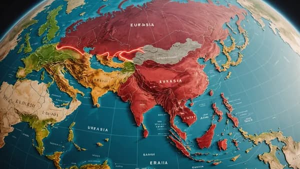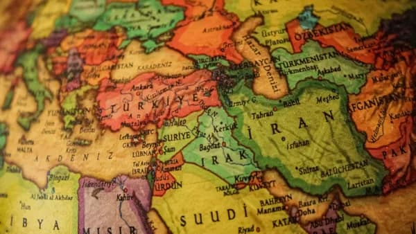
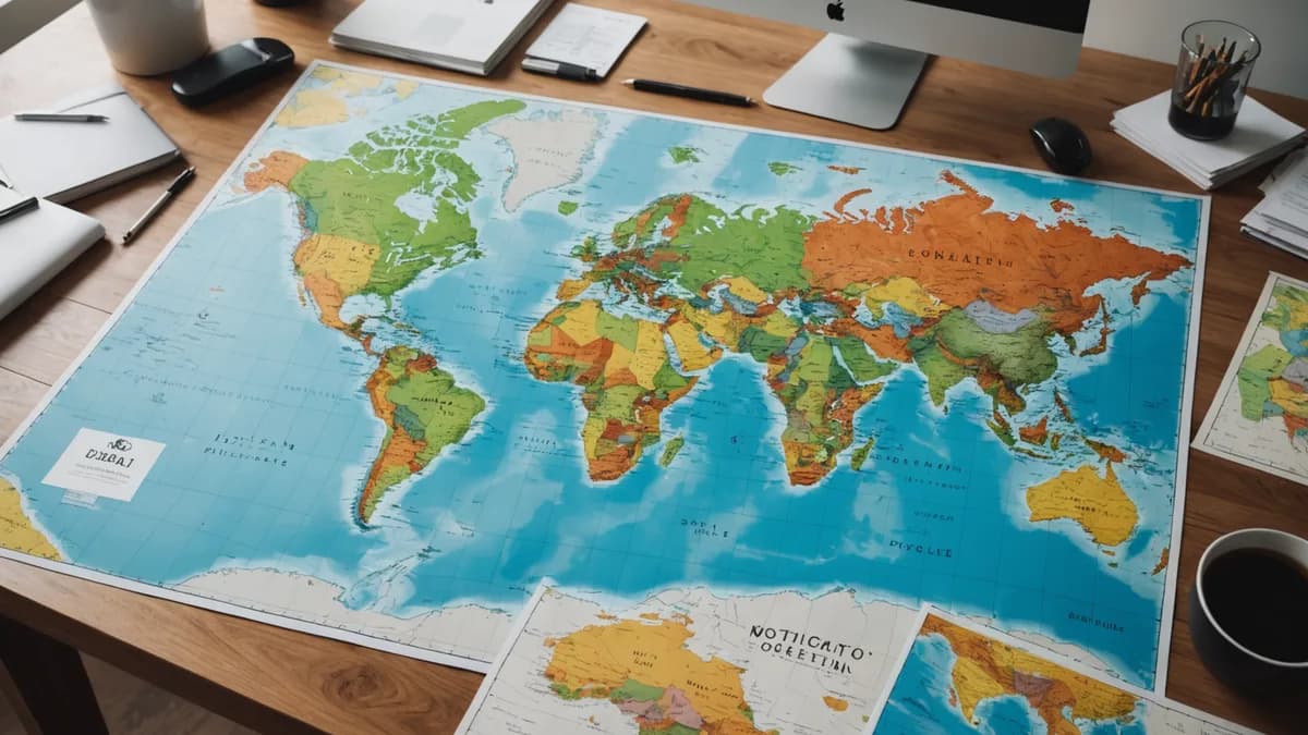
The United Nations has officially voted to replace the world’s predominant map, targeting a single, notorious flaw. On the standard Mercator projection, which powers apps like Google Maps, Africa appears to be roughly the same size as Greenland. In reality, Africa is 14 times larger.
XOOMAR Intelligence
Analyst Take
This move, driven by a “Correct the Map” resolution according to BBC World, shifts global cartography away from a 450-year-old design optimized for colonial navigation toward one that accurately reflects continental scale. It’s a stark admission that the maps we use daily are not neutral. They are compromises, and every choice of projection, what to preserve, what to distort, carries political and economic weight.
The Trade Secret of Every Flat Map: You Can’t Have It All
A globe is the only perfect map. Flattening a sphere onto a rectangle is a geometric impossibility. You must sacrifice something.
Cartography Professor James Cheshire at University College London puts it bluntly: “You can preserve area, or you can preserve shape, or you can preserve distance and direction, but not everything at once perfectly, because otherwise you’d be back to a sphere.”
This is the cartographer’s trilemma. Every world map is a specialized tool, built to excel at one task while failing at others. The familiar Mercator projection, created in 1569, was engineered for a single, vital purpose: sailing.
"He wanted a straight line to be drawn on a map to look like a straight line in reality if you followed a compass bearing," Cheshire told the BBC. "That's what it was intended to do, and that's what it does brilliantly well."
To keep compass bearings straight on paper, Mercator stretched the map’s grid lines wider as they moved from the equator toward the poles. This preserved angles for navigation but massively inflated the size of high-latitude landmasses. Greenland balloons. Antarctica stretches across the bottom of the world. And equatorial continents, chiefly Africa and South America, shrink.
This distortion isn’t a bug. It was the essential feature for its era. But when that navigational tool became the default classroom and digital map, its side effects became the dominant worldview.
How Political Is a Straight Line? The Mercator Bias
The psychological impact is significant. We instinctively perceive larger objects as more important or powerful. The Mercator projection visually enlarges the global north, Europe, North America, Russia, while shrinking the global south.
For Kenyan geographer Kioko Muendo, this has had tangible consequences. “Maps are more than just guides for travellers. They shape how regions are perceived politically and economically,” he told the BBC. The misrepresentation implicitly downplays Africa’s vast resources, population, and investment opportunities.
The core inaccuracy is staggering. The UN resolution highlights that on the Mercator map, Africa is shown as being of similar size to Greenland. The correction? Africa’s true land area is fourteen times greater.
This isn't just an academic error. As we've seen in cases where digital maps redefine geography, like when Google Maps Renames Lake Ontario As 'Lake America', the platforms that host these projections wield immense influence over how we see the world.
The Rebellion Against Mercator: The Peters and Equal Earth Maps
The most famous challenge to Mercator is the Peters projection (based on the earlier Gall projection). Designed by German historian Arno Peters in the early 1970s, it is an equal-area map.
The Core Trade-Off
| Projection | What It Gets Right | What It Sacrifices | Best Use Case |
|---|---|---|---|
| Mercator (1569) | Perfect compass bearings; straight lines are true navigation courses. | Accurate land area; drastically inflates size near poles. | Maritime navigation, web mapping (e.g., Google Maps). |
| Peters (1970s) | Accurate relative land area; fixes the Greenland-Africa size error. | Accurate shape; continents become elongated and distorted. | Comparing statistical data, thematic world maps. |
| Equal Earth (2018) | Accurate land area with more visually pleasing shapes than Peters. | Straight lines & precise distances; not useful for navigation. | General reference, education, institutional adoption (UN, African Union). |
The Peters map squishes polar regions and stretches equatorial zones. It solves the size problem but makes continents look strangely stretched and thin. Russia appears notably smaller. Its straight lines also do not represent true constant compass bearings, rendering it useless for the very purpose Mercator served.
A newer alternative is the Equal Earth projection, developed in 2018. Inspired by the 1963 Robinson projection, it also preserves accurate land area but with more natural-looking shapes than the Peters map. It was adopted by African Union members in February of this year and is now endorsed by the UN.
However, it shares the same core compromise: it sacrifices the straight, navigable lines of Mercator.
The New UN Standard And The Maps You Never See
The UN’s adoption of the Equal Earth projection formalizes a shift that has been building for decades. But it’s just one option in a vast toolkit of specialized maps.
The View from the Pole
The Azimuthal equidistant projection places the world at correct distances from a single center point. The UN flag itself is a perfect example, centering the map on the North Pole. This view gives a unique, disorienting perspective where the southern hemisphere forms a ring around the edge. It’s excellent for showing air routes from a hub but distorts areas and shapes severely.
Turning the World Upside Down
South-up maps simply rotate a traditional map by 180 degrees. This challenges the arbitrary convention that “north” is “up,” a convention with no scientific basis. Some of the first known world maps, like Arab geographer Muhammad al-Idrisi’s 1154 Tabula Rogeriana, placed south at the top. It’s a powerful rhetorical tool for reorienting perspective.
The Pacific-Centric View
Most world maps are centered on the prime meridian (0° longitude) running through Greenwich, London. This places Europe at the center, a legacy of colonial cartography. A Pacific-centred map shifts the chop point to the Atlantic, placing East Asia and Oceania in a more prominent, central position. This is the standard view used across much of Asia and highlights how our “Far East” is only far from a European viewpoint.
Choosing Your Map: A Question of Purpose
There is no single “correct” world map. The right choice depends entirely on what you need it to do.
Need to sail a ship or get walking directions? You need Mercator. Its preservation of angles is why it remains the engine for Google Maps and other digital navigation services. A straight line on that screen corresponds to a steady compass bearing in reality.
Comparing economic output, population, or resource distribution? You need an equal-area projection like Peters or Equal Earth. Any thematic map showing data per country must use this type to avoid visually misrepresenting the data. Using Mercator for a population density map would be statistically misleading.
Want a balanced wall map for a classroom or office? You want a compromise projection like Winkel Tripel (adopted by National Geographic in 1998) or Robinson. These projections deliberately accept small errors in area, shape, and distance to produce a map that looks “right” to the human eye for general reference.
The Critical Takeaway: Always Ask “Why This Map?”
The UN’s decision is a major institutional step, but the deeper lesson is about critical consumption of information. Next time you see a world map, in a news graphic, a corporate report, or a government document, ask what projection it uses and why.
Was it chosen for technical necessity, like the Mercator underpinning your navigation app? Or was it chosen, consciously or not, to subtly emphasize certain parts of the world over others? Just as Ex-Engineer Maps a $60,000 Mistake Beneath America highlighted the value of accurate specialized mapping, understanding projections reveals the frameworks through which we view global relationships.
The forward-looking implication is clear: as global institutions adopt maps like Equal Earth, expect a gradual recalibration in how we visually perceive comparative geography. The next generation of atlases and educational materials will likely not show a Greenland that rivals Africa. That shift will change more than just maps. It will change minds.
Impact Analysis
- The UN's resolution shifts global cartography from a colonial-era navigation tool to a more accurate representation of continental scale, correcting a 450-year-old distortion.
- The change highlights how maps are not neutral but political tools that influence global perceptions of size, importance, and economic weight.
- Adopting a new standard map projection will affect education, navigation apps, and international relations by providing a more truthful geographical baseline.
Primary Sources & Disclosures
Written by
XOOMAR Insights Team
Research and Editorial Desk
The XOOMAR Insights Team pairs automated research with human editorial judgment. We track hundreds of sources across technology, fintech, trading, SaaS, and cybersecurity, cross-check the facts, and explain what happened, why it matters, and what to watch next. We do not just rewrite headlines. Every article is fact-checked and scored for reliability before it goes live, and we link back to the original sources so you can verify anything yourself.